
Saturdays when the kids are in pottery, we leave the car outside the studio and walk over to an independent coffee shop.
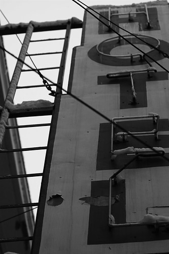
We almost always end up walking under this sign.
Trying it in black and white because it seems to fit with the feel.
shutter 1/200, f4, 70mm, iso 100
Saturday, March 15, 2008
Subscribe to:
Post Comments (Atom)


4 comments:
it almost looks sepia. i love old signs. this one is especially appealing with its peeling. (and no, i didn't initially intend the wordplay there. but i didn't change it once i realized it.)
now that i look at it again, they're more holes than peeling spots. and i didn't catch the drifted snow on the neon tubes the first time!
I love the way you framed this and also that it's in black and white. It feels very timeless.
It reminds me of those old B movie scenes with the hotel sign blinking through the windows. great angle.
Post a Comment